Thursday 22 April 2010

Question 7 - Looking back at your preliminary task, what do you feel you have learnt in the progression from it to the full product?

After working on the preliminary task, i have learned a variety of new things. Some of these include:
  • Experience with a DSLR camera. Prior to the preliminary task I had not used a DSLR camera, so after becoming aware of the uses and functions on the preliminary project, i was able to further and develop skills so i could take a more professional shot.
  • As opposed to the preliminary project, i was a lot more familiar with my target audience, making it a lot easier to create a stylised magazine. This is because i was aware of what sort of language typical "indie-rock" music listeners would use, clothing they would ware, interests they would have, etc. This differs to the preliminary project as it was only a student magazine, making the target audience a lot more diverse.
  • Experience with Quark Xpress and Adobe Photoshop. I have learned more about the functions and tools used on these programs, some of which have been illustrated bellow:

Research and Planning

Differing from the preliminary project, research and planning was a key part of the main coursework task. I have learnt that this is a very important part of creating the magazine, as it allows you to draft and redraft parts of the product. I did this with my logo for example, which was useful as it allowed me to see what worked and what didn't.

- An original draft for my magazine logo. This didn't work because it very bold and eye catching, which is not what i wanted for my magazine.


- The final design for my magazine logo. This worked because it stands out on the page, whilst being quirky and original, which is what i wanted my magazine to represent.

Also, research allowed me to gain inspiration from other magazines, so i could adapt and develop ideas from them. I didn't do this in as much detail for my preliminary project because i couldn't find as many examples of good student magazines. This was something that i learned from after the preliminary because as I lacked inspiration, it was difficult to make a final product. The research into other magazines also allowed me to produce a detailed plan during the research and planning for my main coursework project. This proved helpful later on when taking photos for example, as i knew what i needed to take photo's of, whether they needed to be mid-shot, long-shot, etcetera. This wasn't done for the preliminary but played a very useful part in the production of my magazine.

Comparisons

Question 6 - What have you learnt about technologies from the process of constructing this product?

Adobe Photoshop

Adobe Photoshop has been one of the main pieces of technology that I have used throughout my coursework. Prior to this project, I was familiar with the programme due to the preliminary project and photography work, however I have become far more aware of the tools and uses after creating my magazine. I have used Adobe Photoshop in conjunction with Adobe Lightroom in order to edit and perfect photographs, as well as using it to create both my front cover and contents page. Photoshop makes it easy to manipulate images and text by featuring different "layers" and resizing tools, whilst featuring a wide variety of colours, making it easy to keep the colour scheme corresponding throughout the magazine. Making use of different "layers" whilst manipulating shapes and text on the front cover made it a lot easier to create a more professional feel to my magazine. It was also easy to apply shadow effects to text, helping it stand out on the page.
QuarkXPress

ItalicI used QuarkXPress to create my double page spread. It was a useful program to use because it made it easy to add images and text to the page, however occasionally I found it awkward when arranging them. After getting familiar with the program I found it slightly easier, but on the whole I found Adobe Photoshop more effective for making text and images look professional on a page. The program does allow you to easily create a double page however, and the grid guidelines made it simple to distribute text and images equally on the page.


Facebook

Facebook is a social networking website, and has been incredibly useful throughout the coursework project when collecting audience research. This website allows you to upload photo's so other people can view and make make comments about them. This was useful when finding out which fonts, pictures and colours were appealing to my target audience, as they could leave their comments and opinions about them. This then allowed me to adapt and improve my work so it appealed to my target audience more.


Blogger

Blogger has been the main log of all my coursework, which has been very simple and easy to use. Prior to the preliminary task i was unaware of how to use this website, however it was easy to learn how to arrange text and pictures on a blog, as well as other useful tools like embedding videos from Youtube. Using these tools i have been about to post information about my research and planning, construction and evaluation.

Youtube
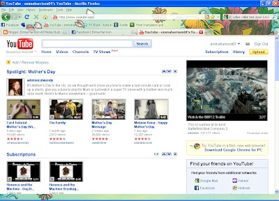
Youtube has been a useful tool when gaining both audience research and evaluation for my magazine. On this website, you can upload videos and retrieve html which allows you embed videos into other websites, such as Blogger - my main coursework log. Throughout the coursework project, I have uploaded various videos in which my target audience are being asked about their opinions on my magazine.
Digital SLR Camera
Before the coursework and preliminary project, I hadn't used a DSLR camera, so it took a bit of practice to learn how to use one. The main camera i used for my coursework was a Canon EOS 400D, which was fairly easy to use after learning about the different settings and features. The zoom on the lens made it very easy to take different shots, such as long shot and medium close up. The flash helped make the shots look more 'flawless', and because the camera had 10 mega pixels, the pictures were more refined making it easier to edit them accurately in Photoshop.

Question 5 - How did you attract and address your audience?

Front Cover
It was important that my front cover appealed to my target audience as the cover is the part of the magazine that will catch the audiences eye. Because of this, i tried to address them in several ways. These were:
  • Font. The majority of the fonts featured on my front cover are sans serif font, which make the magazine look edgy and up to date. There are a few bits of text in a sans serif font as i thought it looked less bold, therefore making it effective for the less important bits of text. The font for my masthead is slightly ragged looking, to connote rebellion and nonconformity. It's also in red, which connotes danger and "alert", which would make it eye catching and appealing to my target audience.
  • Photographs. The main model on the front cover is inspirational to readers because they will be aspire to be a "successful" musician like she is. Also, she represents the genre as she looks quirky and different. The denim shirt she is wearing represents "grunge" culture, and the glasses she's wearing are unique and individual. She connotes an image of rebellion as she is swearing on the front cover, continuing to make her look edgy. A similar connotation is shown by the male on the front cover, as he is smoking a cigarette. Also, he shows his love for music as he is wearing headphones, which will appeal to my target audience as they will be keen music listeners too.
  • Language. I tried to use fairly simplistic yet witty language, so it was easy to read but interesting at the same time. Phrases such as "who the hell do they think they are?" also connote rebellion, as it's blasphemy and would perhaps be slightly offensive to older readers. This would be appealing to my target audience as they would aspire to have that sort of image.
Contents Page
After viewing my front cover, the contents page is the next thing the audience will view, therefore it is important that it is just as appealing. I kept a corresponding colour scheme, so the magazine didn't look mismatched, and i continued to use the same fonts for the majority of the contents page. However i used a different font for the text in small print, as there wasn't any featured like that on the front cover. I used a sans serif font for this, as a serif font would make it look similar to a newspaper and therefore would look slightly old fashioned. Similar simplistic, witty language was also incorporated, so the reader can get a good idea of what is featured in the magazine without having to read into too much detail. The model featured on the left is typically attractive to male readers, so this would make them more likely to read the article that the picture advertises. They would aspire to look like the "editor" as he looks fairly edgy, at the same time as looking quite important. The photograph of a gig would be appealing to the audience also, as typical readers would probably visit gigs regularly.


Double Page Spread
Here, similar aspects are incorporated. The colour scheme is kept the same, so it corresponds to the rest of the magazine, and the people in the pictures are conveying a quirky and interesting image to appeal to readers. Differing slightly from the rest of the magazine; the language used is still intended to be fairly witty, however it is less simplistic as the text is featured in articles. It's was important here that the language used was witty, to engage interest, but also slightly persuasive so the audience would buy the music being described.

Question 4 - Who would be the audience for your media product?

Question 4: Who would be the audience for your media product?
My magazine was aimed at an audience of radical's, aspirer's and underachiever's who have a keen interest in indie-rock music. It was designed so typically readers would aspire to challenge dominant ideology, similar to the model featured on the front cover. Here she connotes a rebellious image, which was designed to appeal to my target audience as they would aim to look edgy and different like she does. My target audience would ideally be college and university students, with the majority of readers being around the age of 15 - 25. However, it could vary marginally with readers being slightly older or slightly younger.


A stereotypical image of an "indie music listener"
I published copies of the front cover, contents and double page spread on the social networking site 'Facebook' and asked my target audience the following questions:
1. Does the front cover interest you? Is it obvious what genre of music the magazine is about?
2. Does the colour scheme correspond with the genre?
3. What catches your eye?
4. Would you buy it?
5. Are the pictures appropriate?
6. What would make the magazine more appealing?
These questions gained responses such as:
"The contents page looks incredably professional! the colour scheme is great, it links well with the front cover and its easy to read the text. I think the editor section catches my eye because of the signature and you would definitely have that in a real magazine. If i was into that music, I would definitely buy this magazine, with the pictures being appropriate. Dont know about the swearing though... it could offend some people.
Overall, AMAZING :)"
"cool stuff. looks very professional"
"1. Font cover does interest me as it looks professional and generally quite cool and there's like intriguing headlines like The Drums one, is kinda obvious what type of music its about because it's kinda grunge looking with Katt swearing and all.
2. Yes
3. The larger fonts catch my eye, pictures, and the little like circles/rectangles over pictures.
4. Yes
5. Sure thang.
6. Not a lot, i don't know. more varying with colour?"

"1) yeah it intrests me and i would say alternative/punk magazine. or maybe rockabilly who knows
2) yeah , nothing more punk/alternative than the colour of blood .
3) the sexy broad with the guitar XD
4) Yeah looks pretty curtis worthy
5) sure is, but i would of prefered more inappropriate ones
6) Free Hat"
"1.Yes because you have kept to the same colour range of red :) and red kinda connotes as like, youthness and indie :) i know what i mean XD Also, can tell its of indie genre because the images including guitars and stuff represents that :)
2. Yess!
3. KATT AND THE NIGHT RIDERS :) and the JUICE CONTENTS sign is rather snazzy
4. Oui :)
5. Yes :) because they attract our age range and stuff. eg, katt with the guitar, and the picture from kings of leon
6. The free hat ;D"
I also filmed some audience research, as it was useful to see their responses to the questions.
Interview with Katt
Name: Katt Wade
Age: 17
Gender: Female
Interests: Playing music, gaming, gigging, smoking, etc.
Interview with Jack
Name: Jack Dugmore
Age: 18
Gender: Male
Interests: Driving, clubbing, drinking, smoking, socialising, etc.
Interview with Becca
Name: Becca Curtis
Age: 16
Gender: Female
Interests: Reading, gigging, drinking, eating subway sandwiches, "gnomes", etc.
Interview with Jess
Name: Jess O'Sullivan
Age: 17
Gender: Female
Interests: Shopping, gigging, playing guitar, smoking, hair dye, etc.

Question 3 - What kind of media institution might distribute your media product and why?

Question 2 - How does your media product represent particular social groups?